Grumpy Sugar – Brand Design

Project Details USED SKILLS Logo DesignLayout BuildingGraphic Design TOOLS AND MATERIALS Adobe Illustrator Adobe Photoshop Chat GPT Ideogram RELATED CATEGORIES Graphic Design (23) Illustration (5) Web & Social Media (11) Previous Project
Catch The Sun Communication
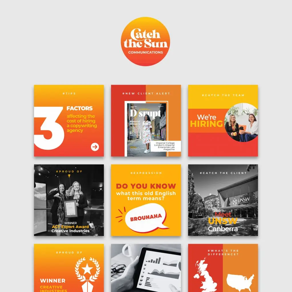
Project Summary CATCH THE SUN INSTAGRAM TEMPLATES For this project, I collaborated with Catch the Sun Communications, a freelance editorial and content agency based in Canberra, Australia. Specializing in copywriting, editing, and proofreading services, Catch the Sun provides creative solutions to clients in the UK, Europe, and Australia. Their goal is to leverage time zone differences to deliver high-quality content quickly, with their signature tagline, “We Catch the Sun™ for our clients.” Project Details USED SKILLS Social Media StrategyGraphic Design TOOLS AND MATERIALS Canva Pro DATE 2024 TEAM Shoelace Creative is a boutique marketing agency known for crafting impactful content that connects deeply with audiences. They provide end-to-end solutions for business growth, focusing on strategic campaigns that deliver measurable results. From concept to delivery, Shoelace handles everything—production, design, and branding—with clear, goal-driven objectives. Visit Website Lorem Ipsum is simply dumy text of the printing typesetting industry lorem ipsum. CLIENT Catch the Sun Communications, a freelance editorial and content agency based in Canberra, Australia. Specializing in copywriting, editing, and proofreading services, Catch the Sun provides creative solutions to clients in the UK, Europe, and Australia. Their goal is to leverage time zone differences to deliver high-quality content quickly, with their signature tagline, “We Catch the Sun™ for our clients.” Visit Website Lorem Ipsum is simply dumy text of the printing typesetting industry lorem ipsum. BRIEFING OVERVIEW: Catch the Sun needed a set of social media graphic templates to enhance their Instagram and LinkedIn presence. The templates had to reflect an evolution in their brand’s visual identity, aligning with the clean and professional aesthetic of their website while retaining the dynamic and creative energy of their Instagram feed. Their key requirements included: A modern, polished design that complements their professional brand image. The use of mono photography to maintain consistency, especially when original photos did not align with the brand’s color scheme. A template collection flexible enough to be updated with new content in the future. THE CREATIVE PROCESS: After receiving the brief, I worked with my team at Shoelace Creative to craft a series of templates via Canva. Our choice of platform was intentional—Canva’s user-friendly interface would allow Catch the Sun to easily edit the templates themselves, enabling them to update content and keep their posts fresh. We developed over 40 templates, segmented into various content categories that aligned with Catch the Sun’s needs. These templates were designed to not only support their current social media strategy but to allow room for future growth and adaptability. Template Categories: Each content theme was designed with its own unique style, but all tied back to the same core visual identity. Here are the main template categories we developed: Meet the Team: Introducing team members with the hashtag #MeetTheTeam. Quotes and Inspiration: A series of motivational quotes under #Inspiration. Client Testimonials: Highlighting feedback with #WhyUs. Educational Posts: Tips on grammar, business, and industry knowledge under #Tips. New Client Announcements: Celebrating new partnerships with #CatchTheClient. Project Highlights: Showcasing work under #LightOnProject. Partnership Announcements: Featuring collaborations with #PartnerShoutout. Hiring Posts: Recruitment updates with #CatchTheTeam. Achievements and Milestones: Celebrating company success with #ProudOf. DESIGN CHOICES: Color Palette: Catch the Sun’s brand colors—orange, yellow, and red—evoke warmth, creativity, and energy. These shades were used in contrast with black-and-white imagery, ensuring a professional yet vibrant feel. Where the original photo colors didn’t match the brand, we opted for mono photography, keeping the focus on key visuals. Typography: Each main content topic was prominently displayed in a hashtag format at the top center of the post. This decision ties into the brand’s sunny, optimistic vibe while offering a modern approach to visual communication. The hashtags also served as quick, recognizable tags, making the posts easy to categorize and identify. Layout: Each template was designed with flexibility in mind. The layout for posts was kept clean and structured, allowing the team at Catch the Sun to easily replace content without compromising design integrity. The strategic use of white space and consistent placement of elements ensures a coherent look across all platforms. FINAL OUTCOME: The final template collection not only met but exceeded the client’s expectations. By aligning the Instagram visuals with the company’s overall brand identity, we were able to present a more unified and professional image for Catch the Sun across all their platforms. The templates are versatile and adaptable, ensuring they will serve as a valuable tool for the agency’s social media strategy in the long run. Project Details USED SKILLS Social Media StrategyGraphic Design TOOLS AND MATERIALS Canva Pro DATE 2024 TEAM Shoelace Creative is a boutique marketing agency known for crafting impactful content that connects deeply with audiences. They provide end-to-end solutions for business growth, focusing on strategic campaigns that deliver measurable results. From concept to delivery, Shoelace handles everything—production, design, and branding—with clear, goal-driven objectives. Visit Website Lorem Ipsum is simply dumy text of the printing typesetting industry lorem ipsum. CLIENT Catch the Sun Communications, a freelance editorial and content agency based in Canberra, Australia. Specializing in copywriting, editing, and proofreading services, Catch the Sun provides creative solutions to clients in the UK, Europe, and Australia. Their goal is to leverage time zone differences to deliver high-quality content quickly, with their signature tagline, “We Catch the Sun™ for our clients.” Visit Website Lorem Ipsum is simply dumy text of the printing typesetting industry lorem ipsum. RELATED CATEGORIES Graphic Design (22) Illustration (4) Web & Social Media (11) SIMILAR PROJECTS Previous Project
Recipe Bestie
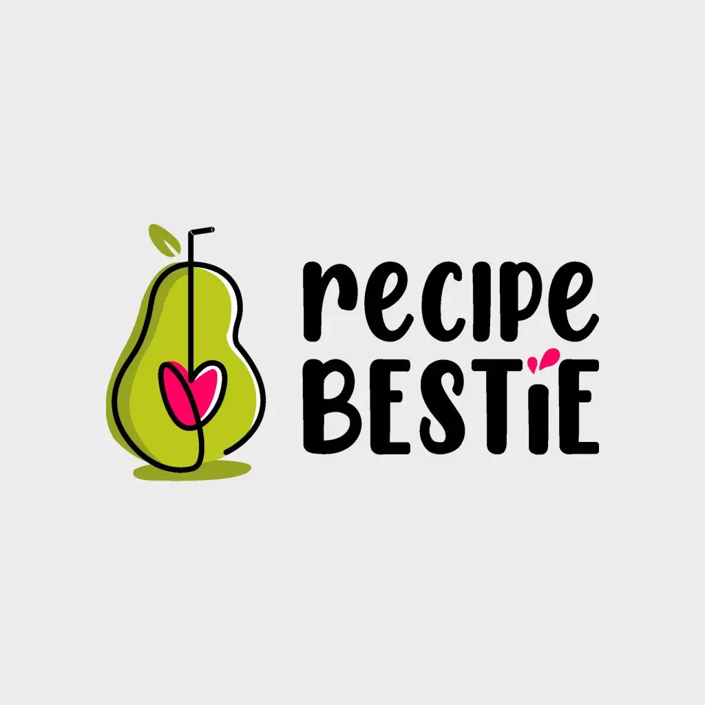
Project Summary Designing the logo for Recipe Bestie, a platform dedicated to healthy and accessible recipes, was a journey that blended creativity with strategic design choices. Here’s an overview of the process: CONCEPTUALIZATION: WELLNESS, HEALTH AND FUN Recipe Bestie embraces wellness (mostly through plant-based recipes), making cooking both enjoyable and effortless. After considering two ideas, we decided to proceed with idea 1: the avocado. Chosen for its versatility in both sweet and savory dishes, the avocado embodies the brand’s diverse offerings. Its shape subtly resembles the letter “B” in Bestie, creating a playful and memorable visual connection. Project Details USED SKILLS Graphic DesignIllustration TOOLS AND MATERIALS Adobe IllustratorAdobe PhotoshopProcreate CLIENT Lancelot Studios is a California-based Graphic Design and Marketing Agency, offering creative, tailored solutions to elevate brands. DESIGN PROCESS: SIMPLICITY WITH A HEARTFELT TWIST The logo features a minimalist, single-line illustration of an avocado. Emphasizing the two rounded halves highlights the “B” shape, enhancing brand recognition. The avocado pit is transformed into a heart connected to a straw, suggesting a smoothie made with love—a whimsical touch that aligns with the brand’s cheerful spirit. TYPOGRAPHY: FUN AND LIGHTHEARTED The font “Chicken Pie Height” by Manjali Studio was chosen for its playful and bold lines, complementing the logo’s friendly vibe. This slightly cartoony style effectively conveys the fun and lightheartedness central to Recipe Bestie‘s identity. COLOR PALETTE: FRESH AND FEMININE Green, evocative of nature and freshness, was paired with magenta, representing the feminine world the brand targets. This combination not only reflects the brand’s focus on healthy living but also appeals to its primary audience. VERSATILITY: MULTIPLE VERSIONS FOR DIFFERENT USES To ensure adaptability across various platforms, the logo was developed in three versions: full color, black and white, and a negative version for dark backgrounds. This versatility allows for consistent branding across digital media, print materials, and merchandise. This project showcases how thoughtful design choices can effectively communicate a brand’s values and personality. From concept to finalization, each step was undertaken with the goal of creating a logo that embodies the joy and simplicity of healthy cooking. Project Details USED SKILLS Graphic DesignIllustration TOOLS AND MATERIALS Adobe IllustratorAdobe PhotoshopProcreate DATE 2024 CLIENT Lancelot Studios is a California-based Graphic Design and Marketing Agency, offering creative, tailored solutions to elevate brands. Visit Website Lorem Ipsum is simply dumy text of the printing typesetting industry lorem ipsum. RELATED CATEGORIES Graphic Design (23) Illustration (5) Web & Social Media (11) SIMILAR PROJECTS Previous ProjectNext Project
Erika DJane Greys
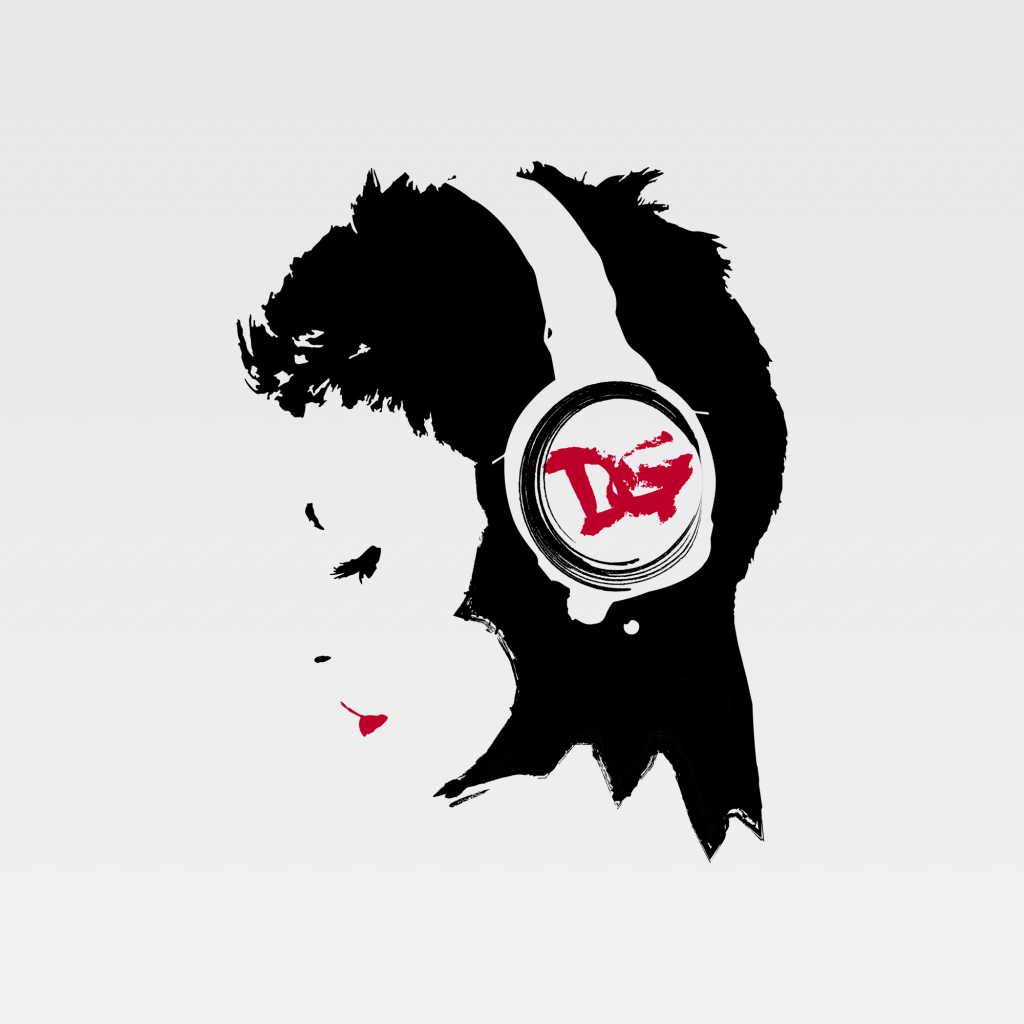
Project Summary As a DJ, producer, and avid psytrance music enthusiast, Erica Grossi (DJane Greys) hails from northern Italy. When she’s not performing, she immerses herself in the studio, crafting new music and fashion statements, starting from her hair (as she is a hair model) to her choice of incredible outfits and trendy music tracks. For this project, she approached me to design a new logo for her personal brand, to be used on CD covers, posters, or as a profile picture. Her face is as iconic as her style, so we developed a logo based on her profile. Since she commonly signs herself as DG, I incorporated these initials into the design, subtly placing them within a headset—an essential element representing her profession. The color scheme of the initials and lips changes with the background, mirroring her dynamic nature: just as she changes her dress style and hairstyle every month Project Details USED SKILLS Photo EditingLogo DesignGraphic Design TOOLS AND MATERIALS Adobe IllustratorAdobe Photoshop DATE 2018 CLIENT As a DJ, producer, and avid psytrance music enthusiast, Erica Grossi (DJane Greys) hails from northern Italy. When she’s not performing, she immerses herself in the studio, crafting new music and fashion statements, starting from her hair (as she is a hair model) to her choice of incredible outfits and trendy music tracks. Instagram Project Details USED SKILLS Photo EditingLogo DesignGraphic Design TOOLS AND MATERIALS Adobe IndesignAdobe PhotoshopGoogle DocsPages / Office Word DATE 2018 CLIENT As a DJ, producer, and avid psytrance music enthusiast, Erica Grossi (DJane Greys) hails from northern Italy. When she’s not performing, she immerses herself in the studio, crafting new music and fashion statements, starting from her hair (as she is a hair model) to her choice of incredible outfits and trendy music tracks. Instagram SIMILAR PROJECTS Previous ProjectNext Project
Pungas
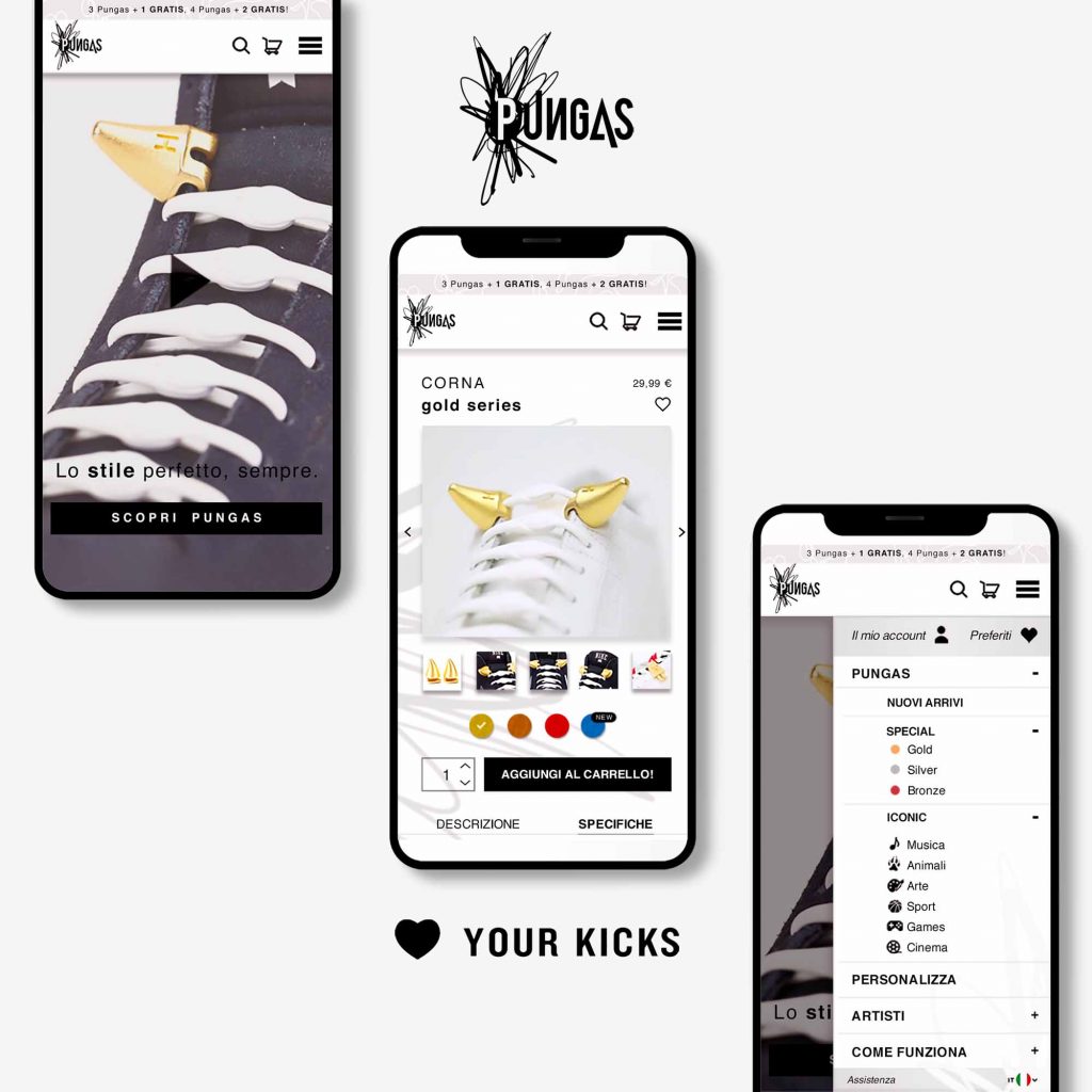
Project Summary Pungas are bold sneakers accessories, 3D printed, easy to use, wearable on different parts of the sneakers and colorful. These are the byproduct of an exclusive collaboration between Hickies and international artists/designers. They are entirely customizable, offering a myriad of options to tailor them precisely to individual preferences, ensuring a unique and personalized touch to the each shoe. These innovative accessories seamlessly attach to Hickies laces, complementing the brand’s ecosystem of cutting-edge products designed to revolutionize footwear. Operating exclusively through online channels, the company leverages the digital landscape to reach its audience effectively. The project encompassed a comprehensive brand communication strategy, spanning both online and offline platforms, aligned with the established brand identity. In my role, I took charge of several key aspects of the project, beginning with the development of a dynamic logo that embodies the essence of the brand and serves as a powerful visual representation of its identity. Additionally, I crafted visually appealing and functional product packaging and corporate image that includes envelope, business card, printed materials. Furthermore, I led the design process for a user-friendly website, optimizing every element to ensure seamless navigation and engagement across all devices. In conjunction with these efforts, I devised and executed compelling advertising campaigns (Facebook Ads) across social media platforms. These campaigns were strategically designed to amplify brand visibility and drive traffic to the e-commerce platform, while also showcasing the bespoke customization services available for creating personalized Pungas. Project Details USED SKILLS Graphic DesignEditorial DesignVisual BrandingWeb DesignLogo DesignUI / UX DesignAdvertisingPackaging TOOLS AND MATERIALS Adobe IndesignAdobe PhotoshopAdobe IllustratorFacebookMeta DATE 2019 CLIENT Pungas are bold sneakers accessories, 3D printed, easy to use, wearable on different parts of the sneakers and colorful. These are the byproduct of an exclusive collaboration between Hickies and international artists/designers. They are entirely customizable, offering a myriad of options to tailor them precisely to individual preferences, ensuring a unique and personalized touch to the each shoe. Project Details USED SKILLS Graphic DesignEditorial DesignVisual BrandingWeb DesignLogo DesignUI / UX DesignAdvertisingPackaging TOOLS AND MATERIALS Adobe IndesignAdobe PhotoshopAdobe IllustratorFacebookMeta DATE 2019 CLIENT Pungas are bold sneakers accessories, 3D printed, easy to use, wearable on different parts of the sneakers and colorful. These are the byproduct of an exclusive collaboration between Hickies and international artists/designers. They are entirely customizable, offering a myriad of options to tailor them precisely to individual preferences, ensuring a unique and personalized touch to the each shoe. SIMILAR PROJECTS Previous ProjectNext Project
Morfè
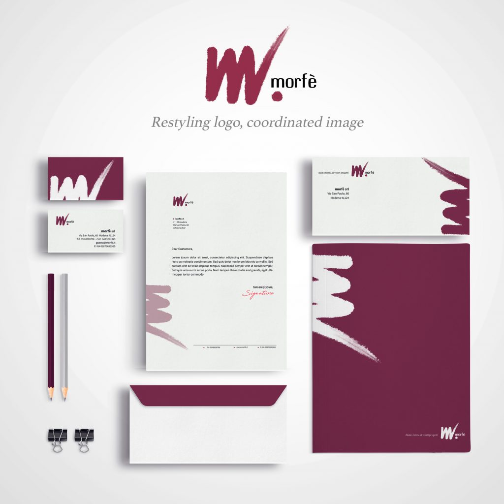
Project Summary Morfè is a Business Consulting Company founded in 2003 with the aim of providing high-quality executive and organizational consulting. In 2021, recognizing the importance of maintaining a fresh and contemporary corporate image, we embarked on a journey to renew their corporate identity. I started with the redesign of their company logo, seeking a winning proposal that would refresh the visual appearance without compromising the integrity and recognizability of the brand. The result is a refreshed look that retains the distinctive colors of the original logo, ensuring visual clarity and simplicity in design, reflecting their constant pursuit of innovation and quality. The elements subject to redesign included the logo and its various variations, the letterhead with its corresponding envelope, the folder, and the new business cards. Project Details USED SKILLS Brand restylingCoordinated imagedLogo Design TOOLS AND MATERIALS Adobe IllustratorAdobe Photoshop DATE 2021 CLIENT DETAILS Morfè is a Business Consulting Company founded in 2003 with the aim of providing high-quality executive and organizational consulting. They cater to companies seeking to manage change in a modern, dynamic and effective manner, supporting them in the transformation and optimization of their business processes. Client Website Project Details USED SKILLS Brand restylingCoordinated imagedLogo Design TOOLS AND MATERIALS Adobe IllustratorAdobe Photoshop DATE 2021 CLIENT DETAILS Morfè is a Business Consulting Company founded in 2003 with the aim of providing high-quality executive and organizational consulting. They cater to companies seeking to manage change in a modern, dynamic and effective manner, supporting them in the transformation and optimization of their business processes. Client Website SIMILAR PROJECT Previous ProjectNext Project
Colle Santa Lucia Fursil’s Mines
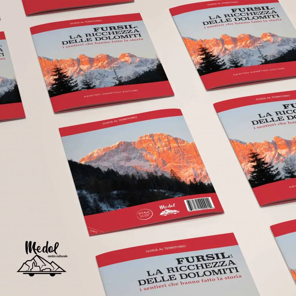
Project Summary Colle Santa Lucia is an Italian municipality in the province of Belluno, in the Veneto region. It’s one of the eighteen municipalities comprising Ladino, the Dolomite Alpine region historically known for the Ladino language. Representatives of Colle Santa Lucia requested the creation of a visual identity to reflect the strong cultural identity of the municipality, including an editorial product and a brochure to illustrate its history. The municipality has two distinct communication lines: Medol, the cultural center showcasing artistic richness, and Fursil’s Mines, the historic mining site. The logos and colors of Medol and Fursil’s Mines serve as the foundation for the entire graphic project. In collaboration with the IUSVE team, we developed: Logo proposals and restyling; Advertising concepts; Informative brochures; Website designs; Visual identities; Merchandise; An illustrated book on Delibana legends; A scale model of the museum exhibition hosted by the cultural center. Project Details USED SKILLS Editorial DesignLayout BuildingImpaginationGraphic DesignWeb DesignVisual IdentityBrand promotionCreative Writing TOOLS AND MATERIALS Adobe IndesignAdobe PhotoshopAdobe IllustratorPages / Office Word DATE 2017 CLIENT Colle Santa Lucia is an Italian municipality in the province of Belluno, in the Veneto region. It’s one of the eighteen municipalities comprising Ladino, the Dolomite Alpine region historically known for the Ladino language. Visit Website Project Details USED SKILLS Editorial DesignLayout BuildingImpaginationGraphic DesignWeb DesignVisual IdentityBrand promotionCreative Writing TOOLS AND MATERIALS Adobe IndesignAdobe PhotoshopAdobe IllustratorPages / Office Word DATE 2017 CLIENT Colle Santa Lucia is an Italian municipality in the province of Belluno, in the Veneto region. It’s one of the eighteen municipalities comprising Ladino, the Dolomite Alpine region historically known for the Ladino language. Visit Website RELATED POSTS Previous Project

