Designing the logo for Recipe Bestie, a platform dedicated to healthy and accessible recipes, was a journey that blended creativity with strategic design choices.
Here’s an overview of the process:
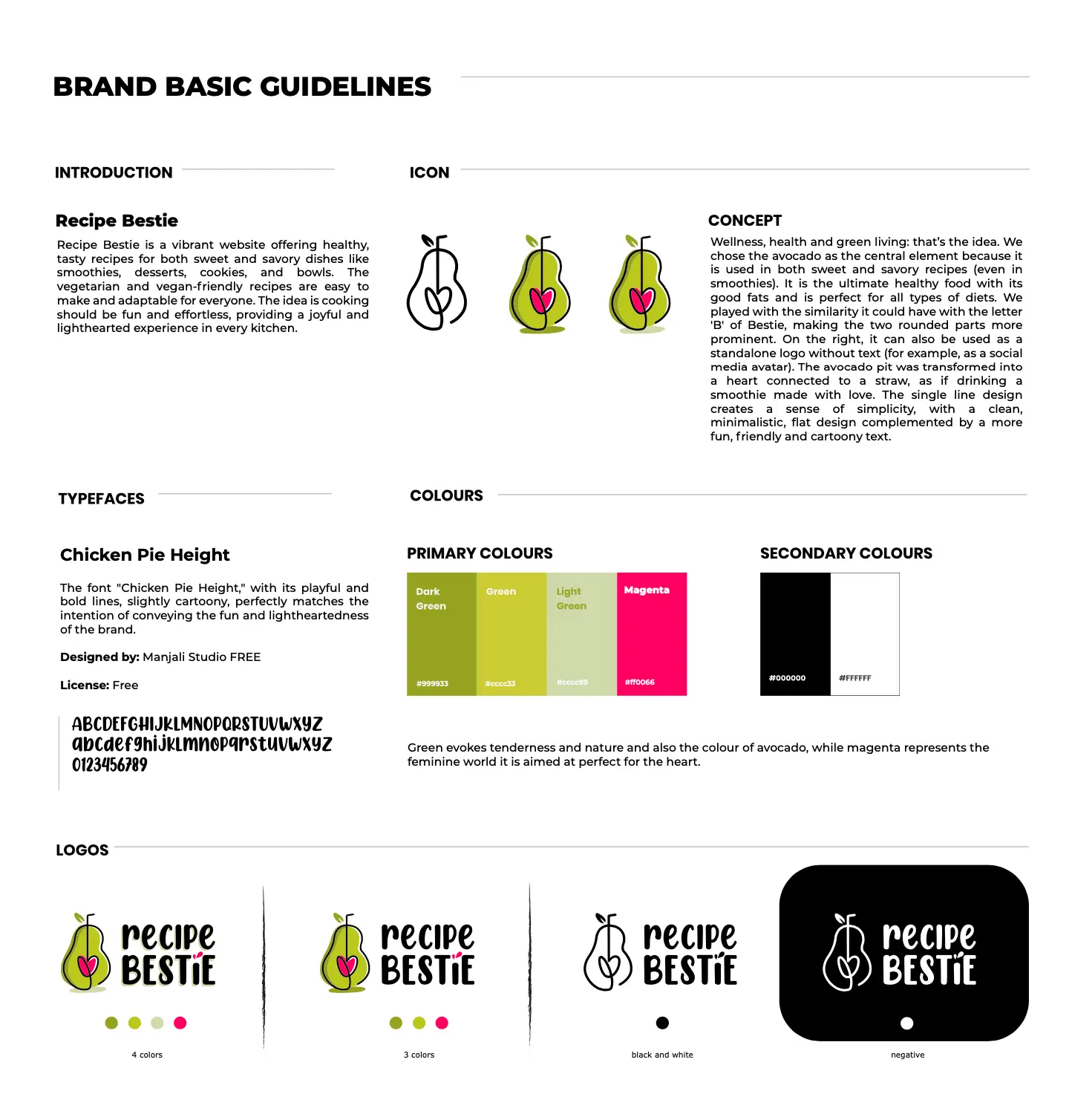
CONCEPTUALIZATION: WELLNESS, HEALTH AND FUN
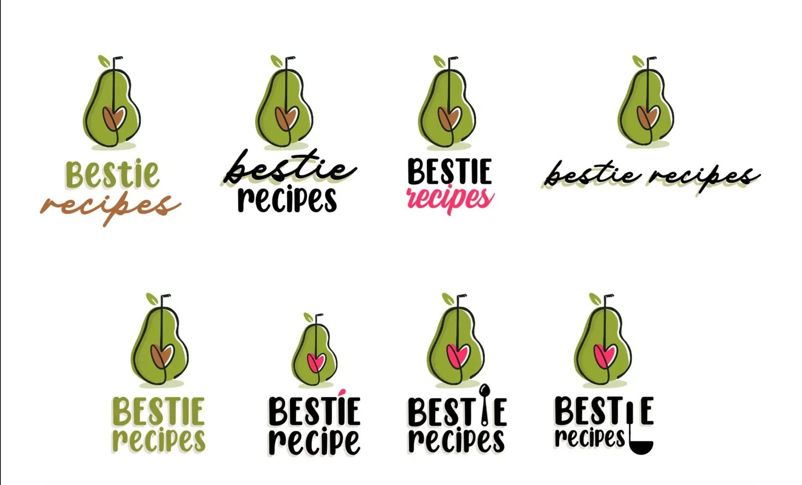
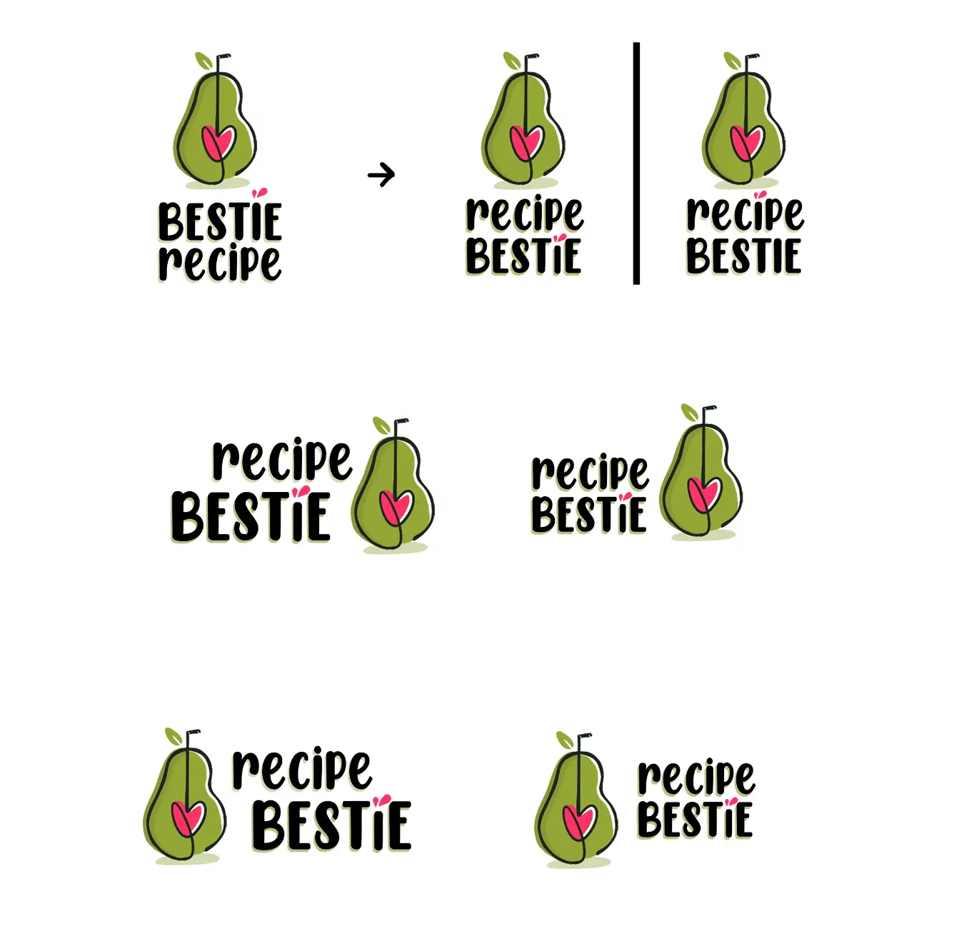
Recipe Bestie embraces wellness (mostly through plant-based recipes), making cooking both enjoyable and effortless. After considering two ideas, we decided to proceed with idea 1: the avocado. Chosen for its versatility in both sweet and savory dishes, the avocado embodies the brand’s diverse offerings. Its shape subtly resembles the letter “B” in Bestie, creating a playful and memorable visual connection.
Project Details
USED SKILLS
Graphic Design Illustration
TOOLS AND MATERIALS
Adobe Illustrator Adobe Photoshop Procreate
CLIENT
Lancelot Studios is a California-based Graphic Design and Marketing Agency, offering creative, tailored solutions to elevate brands.
DESIGN PROCESS: SIMPLICITY WITH A HEARTFELT TWIST
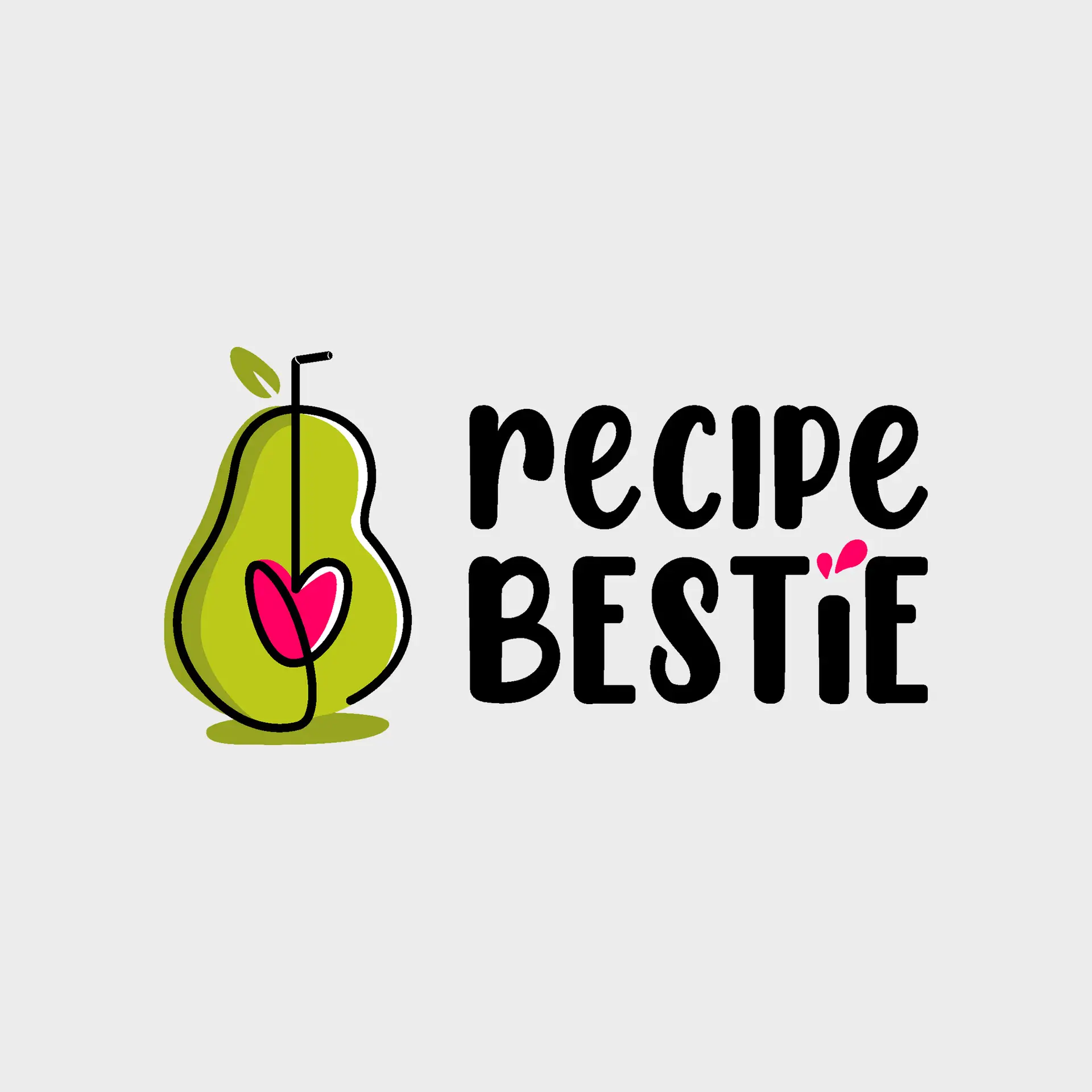
The logo features a minimalist, single-line illustration of an avocado. Emphasizing the two rounded halves highlights the “B” shape, enhancing brand recognition. The avocado pit is transformed into a heart connected to a straw, suggesting a smoothie made with love—a whimsical touch that aligns with the brand’s cheerful spirit.
TYPOGRAPHY: FUN AND LIGHTHEARTED
The font “Chicken Pie Height” by Manjali Studio was chosen for its playful and bold lines, complementing the logo’s friendly vibe. This slightly cartoony style effectively conveys the fun and lightheartedness central to Recipe Bestie‘s identity.
COLOR PALETTE: FRESH AND FEMININE
Green, evocative of nature and freshness, was paired with magenta, representing the feminine world the brand targets. This combination not only reflects the brand’s focus on healthy living but also appeals to its primary audience.
VERSATILITY: MULTIPLE VERSIONS FOR DIFFERENT USES
To ensure adaptability across various platforms, the logo was developed in three versions: full color, black and white, and a negative version for dark backgrounds. This versatility allows for consistent branding across digital media, print materials, and merchandise.
This project showcases how thoughtful design choices can effectively communicate a brand’s values and personality. From concept to finalization, each step was undertaken with the goal of creating a logo that embodies the joy and simplicity of healthy cooking.
Project Details
USED SKILLS
Graphic Design Illustration
TOOLS AND MATERIALS
Adobe Illustrator Adobe Photoshop Procreate
DATE
2024
CLIENT
Lancelot Studios is a California-based Graphic Design and Marketing Agency, offering creative, tailored solutions to elevate brands.