Grumpy Sugar – Brand Design
Project Details USED SKILLS Logo DesignLayout BuildingGraphic Design TOOLS AND MATERIALS Adobe Illustrator Adobe Photoshop Chat GPT Ideogram RELATED CATEGORIES Graphic Design (23) Illustration (5) Web & Social Media (11) Previous Project
Catch The Sun Communication
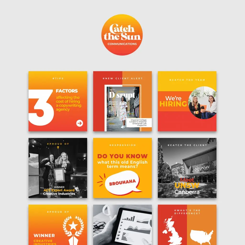
Project Summary CATCH THE SUN INSTAGRAM TEMPLATES For this project, I collaborated with Catch the Sun Communications, a freelance editorial and content agency based in Canberra, Australia. Specializing in copywriting, editing, and proofreading services, Catch the Sun provides creative solutions to clients in the UK, Europe, and Australia. Their goal is to leverage time zone differences to deliver high-quality content quickly, with their signature tagline, “We Catch the Sun™ for our clients.” Project Details USED SKILLS Social Media StrategyGraphic Design TOOLS AND MATERIALS Canva Pro DATE 2024 TEAM Shoelace Creative is a boutique marketing agency known for crafting impactful content that connects deeply with audiences. They provide end-to-end solutions for business growth, focusing on strategic campaigns that deliver measurable results. From concept to delivery, Shoelace handles everything—production, design, and branding—with clear, goal-driven objectives. Visit Website Lorem Ipsum is simply dumy text of the printing typesetting industry lorem ipsum. CLIENT Catch the Sun Communications, a freelance editorial and content agency based in Canberra, Australia. Specializing in copywriting, editing, and proofreading services, Catch the Sun provides creative solutions to clients in the UK, Europe, and Australia. Their goal is to leverage time zone differences to deliver high-quality content quickly, with their signature tagline, “We Catch the Sun™ for our clients.” Visit Website Lorem Ipsum is simply dumy text of the printing typesetting industry lorem ipsum. BRIEFING OVERVIEW: Catch the Sun needed a set of social media graphic templates to enhance their Instagram and LinkedIn presence. The templates had to reflect an evolution in their brand’s visual identity, aligning with the clean and professional aesthetic of their website while retaining the dynamic and creative energy of their Instagram feed. Their key requirements included: A modern, polished design that complements their professional brand image. The use of mono photography to maintain consistency, especially when original photos did not align with the brand’s color scheme. A template collection flexible enough to be updated with new content in the future. THE CREATIVE PROCESS: After receiving the brief, I worked with my team at Shoelace Creative to craft a series of templates via Canva. Our choice of platform was intentional—Canva’s user-friendly interface would allow Catch the Sun to easily edit the templates themselves, enabling them to update content and keep their posts fresh. We developed over 40 templates, segmented into various content categories that aligned with Catch the Sun’s needs. These templates were designed to not only support their current social media strategy but to allow room for future growth and adaptability. Template Categories: Each content theme was designed with its own unique style, but all tied back to the same core visual identity. Here are the main template categories we developed: Meet the Team: Introducing team members with the hashtag #MeetTheTeam. Quotes and Inspiration: A series of motivational quotes under #Inspiration. Client Testimonials: Highlighting feedback with #WhyUs. Educational Posts: Tips on grammar, business, and industry knowledge under #Tips. New Client Announcements: Celebrating new partnerships with #CatchTheClient. Project Highlights: Showcasing work under #LightOnProject. Partnership Announcements: Featuring collaborations with #PartnerShoutout. Hiring Posts: Recruitment updates with #CatchTheTeam. Achievements and Milestones: Celebrating company success with #ProudOf. DESIGN CHOICES: Color Palette: Catch the Sun’s brand colors—orange, yellow, and red—evoke warmth, creativity, and energy. These shades were used in contrast with black-and-white imagery, ensuring a professional yet vibrant feel. Where the original photo colors didn’t match the brand, we opted for mono photography, keeping the focus on key visuals. Typography: Each main content topic was prominently displayed in a hashtag format at the top center of the post. This decision ties into the brand’s sunny, optimistic vibe while offering a modern approach to visual communication. The hashtags also served as quick, recognizable tags, making the posts easy to categorize and identify. Layout: Each template was designed with flexibility in mind. The layout for posts was kept clean and structured, allowing the team at Catch the Sun to easily replace content without compromising design integrity. The strategic use of white space and consistent placement of elements ensures a coherent look across all platforms. FINAL OUTCOME: The final template collection not only met but exceeded the client’s expectations. By aligning the Instagram visuals with the company’s overall brand identity, we were able to present a more unified and professional image for Catch the Sun across all their platforms. The templates are versatile and adaptable, ensuring they will serve as a valuable tool for the agency’s social media strategy in the long run. Project Details USED SKILLS Social Media StrategyGraphic Design TOOLS AND MATERIALS Canva Pro DATE 2024 TEAM Shoelace Creative is a boutique marketing agency known for crafting impactful content that connects deeply with audiences. They provide end-to-end solutions for business growth, focusing on strategic campaigns that deliver measurable results. From concept to delivery, Shoelace handles everything—production, design, and branding—with clear, goal-driven objectives. Visit Website Lorem Ipsum is simply dumy text of the printing typesetting industry lorem ipsum. CLIENT Catch the Sun Communications, a freelance editorial and content agency based in Canberra, Australia. Specializing in copywriting, editing, and proofreading services, Catch the Sun provides creative solutions to clients in the UK, Europe, and Australia. Their goal is to leverage time zone differences to deliver high-quality content quickly, with their signature tagline, “We Catch the Sun™ for our clients.” Visit Website Lorem Ipsum is simply dumy text of the printing typesetting industry lorem ipsum. RELATED CATEGORIES Graphic Design (22) Illustration (4) Web & Social Media (11) SIMILAR PROJECTS Previous Project
Recipe Bestie
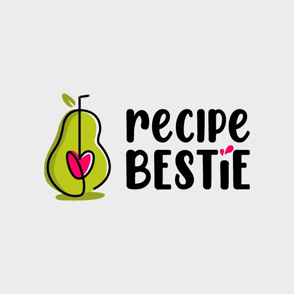
Project Summary Designing the logo for Recipe Bestie, a platform dedicated to healthy and accessible recipes, was a journey that blended creativity with strategic design choices. Here’s an overview of the process: CONCEPTUALIZATION: WELLNESS, HEALTH AND FUN Recipe Bestie embraces wellness (mostly through plant-based recipes), making cooking both enjoyable and effortless. After considering two ideas, we decided to proceed with idea 1: the avocado. Chosen for its versatility in both sweet and savory dishes, the avocado embodies the brand’s diverse offerings. Its shape subtly resembles the letter “B” in Bestie, creating a playful and memorable visual connection. Project Details USED SKILLS Graphic DesignIllustration TOOLS AND MATERIALS Adobe IllustratorAdobe PhotoshopProcreate CLIENT Lancelot Studios is a California-based Graphic Design and Marketing Agency, offering creative, tailored solutions to elevate brands. DESIGN PROCESS: SIMPLICITY WITH A HEARTFELT TWIST The logo features a minimalist, single-line illustration of an avocado. Emphasizing the two rounded halves highlights the “B” shape, enhancing brand recognition. The avocado pit is transformed into a heart connected to a straw, suggesting a smoothie made with love—a whimsical touch that aligns with the brand’s cheerful spirit. TYPOGRAPHY: FUN AND LIGHTHEARTED The font “Chicken Pie Height” by Manjali Studio was chosen for its playful and bold lines, complementing the logo’s friendly vibe. This slightly cartoony style effectively conveys the fun and lightheartedness central to Recipe Bestie‘s identity. COLOR PALETTE: FRESH AND FEMININE Green, evocative of nature and freshness, was paired with magenta, representing the feminine world the brand targets. This combination not only reflects the brand’s focus on healthy living but also appeals to its primary audience. VERSATILITY: MULTIPLE VERSIONS FOR DIFFERENT USES To ensure adaptability across various platforms, the logo was developed in three versions: full color, black and white, and a negative version for dark backgrounds. This versatility allows for consistent branding across digital media, print materials, and merchandise. This project showcases how thoughtful design choices can effectively communicate a brand’s values and personality. From concept to finalization, each step was undertaken with the goal of creating a logo that embodies the joy and simplicity of healthy cooking. Project Details USED SKILLS Graphic DesignIllustration TOOLS AND MATERIALS Adobe IllustratorAdobe PhotoshopProcreate DATE 2024 CLIENT Lancelot Studios is a California-based Graphic Design and Marketing Agency, offering creative, tailored solutions to elevate brands. Visit Website Lorem Ipsum is simply dumy text of the printing typesetting industry lorem ipsum. RELATED CATEGORIES Graphic Design (23) Illustration (5) Web & Social Media (11) SIMILAR PROJECTS Previous ProjectNext Project
Le principesse Disney
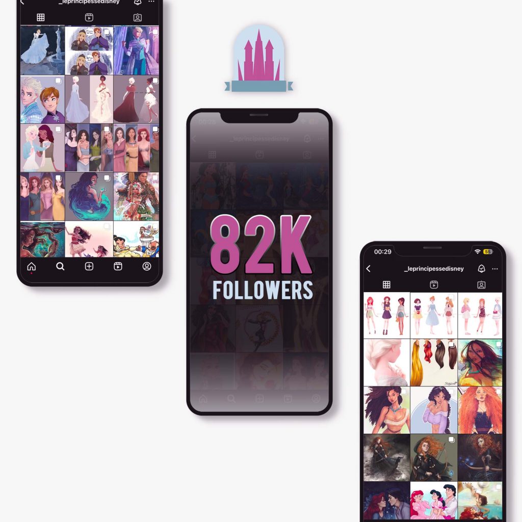
Project Summary Disney Princesses is an organization based in northern Italy with a community of over 180,000 fans online. It has gained credibility through the Disney brand by organizing events throughout Italy through collaborations from all over. Through social media pages and the blog, it has become known among fans and organizes and participates in events dedicated to the nerd world, bringing Disney magic. Among their main activities: cosplay gatherings, animation and singing, homemade gadgets sales and collaborations with artists to entertain adults and children. Disney Princesses approached me back in 2017 to strengthen their online presence on Instagram. At that time, they worked exclusively using Facebook and did not have an Instagram page. I initiated and built their communication on Instagram, taking the page from 0 to 80k followers in 7 months. Through extensive study of their Facebook communication, I adapted their style and way of working to the Instagram platform, recreating a new audience through constant weekly reports, studying Italian and foreign competitors and careful use of correct hashtags. The Instagram audience turned out to be completely different from the one following the page on Facebook, so I set up a visual strategy based on the use of specific fan art harmonized according to a color code and defined theme, and a constant publication of three daily posts according to the times suggested by insights that generated organic growth in a few months. As the page’s authority grew, we created collaborations with artists that consisted of publishing exclusive fan art for our page, games and live quizzes from events for online followers, collaborations with cosplayers and live singers. The purpose, in addition to creating authority on Instagram that kept pace with Facebook numbers, was to promote online and offline events organized by the organization. I then created dedicated graphics to promote initiatives through stories and posts. Later on, I began to follow the organization at events as a Social Media Manager to coordinate the social media communication of the staff during their work, creating material for social media pages through live photos and videos. Additionally, at some events, I attended as a Disney-themed illustrator, carving out hours of activities scheduling. Project Details USED SKILLS Graphic DesignIllustrationTraditional and digital artSocial Media ManagerSocial StrategyVisual StrategyCreative Writing TOOLS AND MATERIALS Adobe IllustratorAdobe PhotoshopInstagramFacebookDrawing’s tools DATE 2017-2018 CLIENT Disney Princesses is an organization based in northern Italy with a community of over 180,000 fans online. It has gained credibility through the Disney brand by organizing events throughout Italy through collaborations from all over. Through social media pages and the blog, it has become known among fans and organizes and participates in events dedicated to the nerd world, bringing Disney magic. Among their main activities: cosplay gatherings, animation and singing, homemade gadgets sales and collaborations with artists to entertain adults and children. Instagram Facebook Project Details USED SKILLS Graphic DesignIllustrationTraditional and digital artSocial Media ManagerSocial StrategyVisual StrategyCreative Writing TOOLS AND MATERIALS Adobe IllustratorAdobe PhotoshopInstagramFacebookDrawing’s tools DATE 2017-2018 CLIENT Disney Princesses is an organization based in northern Italy with a community of over 180,000 fans online. It has gained credibility through the Disney brand by organizing events throughout Italy through collaborations from all over. Through social media pages and the blog, it has become known among fans and organizes and participates in events dedicated to the nerd world, bringing Disney magic. Among their main activities: cosplay gatherings, animation and singing, homemade gadgets sales and collaborations with artists to entertain adults and children. Instagram Facebook RELATED PROJECTS Previous ProjectNext Project
Cynical Plot
Project Summary Cynical Plot is an Instagram page themed around nerd culture, dedicated to reviews of books, TV shows, movies, and comics. The premise is that anyone can easily find the plot of a book or a movie, as well as reviews, online. Therefore, the creator chooses to tell the contents, whether loved or disliked, in her own way: in a cynical and witty manner, guiding the follower and preparing them for what they might encounter in the work without holding back. Hence, the name. I’ve crafted each post to adhere to a cohesive visual theme, primarily utilizing photomanipulation for content creation. The format includes her hand presenting the item to be reviewed in subsequent carousel posts. Through a purely visual cover, she grabs the follower’s attention, already communicating the content of the subsequent images and enticing them to click amidst the chaos of posts in their feed. The cover, due to its visual appeal, is also easily shareable on stories compared to a normal photo of a book. By working on this aspect, the differentiation from competitors is evident. The carousel consists of 5 images: the captivating cover, some details about the product followed by entertaining hashtags, a brief cynical plot summary, suggestions with pros and cons aimed at helping the audience understand if they might enjoy the work, and finally, the call to action to follow the page and comment. The description is dedicated to the author’s notes, providing further information regarding the post. These types of carousels are part of a broader context, alternating between genres, types of products, and a color code based on light shades. Project Details USED SKILLS Copy WritingPhoto EditingPhotomanipulationGraphic DesignSocial StrategySocial Media ManagementVisual StrategyContent CreationCreative Thinking TOOLS AND MATERIALS Adobe PhotoshopInstagramPhone CLIENT Cynical Plot is an Instagram page themed around nerd culture, dedicated to reviews of books, TV shows, movies, and comics. The premise is that anyone can easily find the plot of a book or a movie, as well as reviews, online. Therefore, the creator chooses to tell the contents, whether loved or disliked, in her own way: in a cynical and witty manner, guiding the follower and preparing them for what they might encounter in the work without holding back. Hence, the name. Project Details USED SKILLS Copy WritingPhoto EditingPhotomanipulationGraphic DesignSocial StrategySocial Media ManagementVisual StrategyContent CreationCreative Thinking TOOLS AND MATERIALS Adobe PhotoshopInstagramPhone CLIENT Cynical Plot is an Instagram page themed around nerd culture, dedicated to reviews of books, TV shows, movies, and comics. The premise is that anyone can easily find the plot of a book or a movie, as well as reviews, online. Therefore, the creator chooses to tell the contents, whether loved or disliked, in her own way: in a cynical and witty manner, guiding the follower and preparing them for what they might encounter in the work without holding back. Hence, the name. SIMILAR PROJECTS Previous ProjectNext Project
Erika DJane Greys
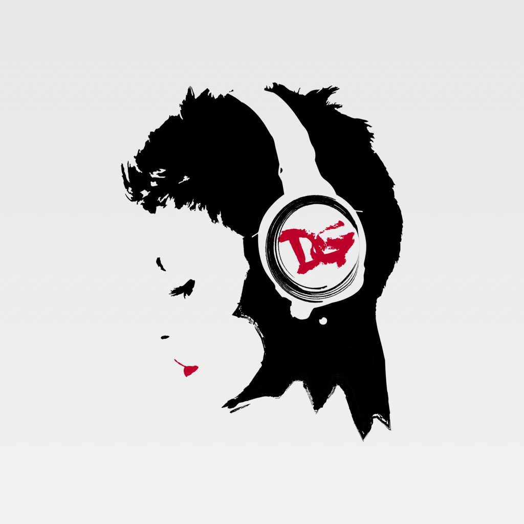
Project Summary As a DJ, producer, and avid psytrance music enthusiast, Erica Grossi (DJane Greys) hails from northern Italy. When she’s not performing, she immerses herself in the studio, crafting new music and fashion statements, starting from her hair (as she is a hair model) to her choice of incredible outfits and trendy music tracks. For this project, she approached me to design a new logo for her personal brand, to be used on CD covers, posters, or as a profile picture. Her face is as iconic as her style, so we developed a logo based on her profile. Since she commonly signs herself as DG, I incorporated these initials into the design, subtly placing them within a headset—an essential element representing her profession. The color scheme of the initials and lips changes with the background, mirroring her dynamic nature: just as she changes her dress style and hairstyle every month Project Details USED SKILLS Photo EditingLogo DesignGraphic Design TOOLS AND MATERIALS Adobe IllustratorAdobe Photoshop DATE 2018 CLIENT As a DJ, producer, and avid psytrance music enthusiast, Erica Grossi (DJane Greys) hails from northern Italy. When she’s not performing, she immerses herself in the studio, crafting new music and fashion statements, starting from her hair (as she is a hair model) to her choice of incredible outfits and trendy music tracks. Instagram Project Details USED SKILLS Photo EditingLogo DesignGraphic Design TOOLS AND MATERIALS Adobe IndesignAdobe PhotoshopGoogle DocsPages / Office Word DATE 2018 CLIENT As a DJ, producer, and avid psytrance music enthusiast, Erica Grossi (DJane Greys) hails from northern Italy. When she’s not performing, she immerses herself in the studio, crafting new music and fashion statements, starting from her hair (as she is a hair model) to her choice of incredible outfits and trendy music tracks. Instagram SIMILAR PROJECTS Previous ProjectNext Project
Pungas
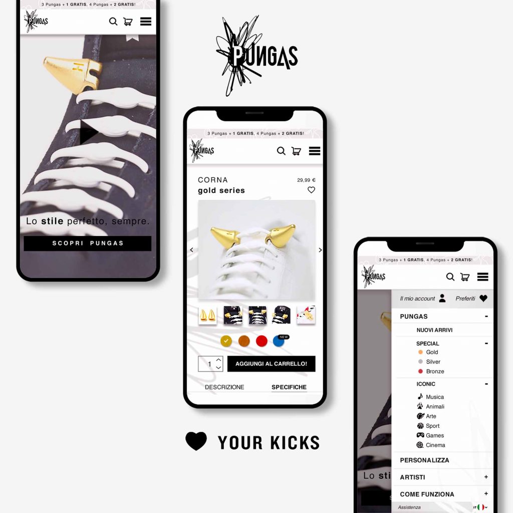
Project Summary Pungas are bold sneakers accessories, 3D printed, easy to use, wearable on different parts of the sneakers and colorful. These are the byproduct of an exclusive collaboration between Hickies and international artists/designers. They are entirely customizable, offering a myriad of options to tailor them precisely to individual preferences, ensuring a unique and personalized touch to the each shoe. These innovative accessories seamlessly attach to Hickies laces, complementing the brand’s ecosystem of cutting-edge products designed to revolutionize footwear. Operating exclusively through online channels, the company leverages the digital landscape to reach its audience effectively. The project encompassed a comprehensive brand communication strategy, spanning both online and offline platforms, aligned with the established brand identity. In my role, I took charge of several key aspects of the project, beginning with the development of a dynamic logo that embodies the essence of the brand and serves as a powerful visual representation of its identity. Additionally, I crafted visually appealing and functional product packaging and corporate image that includes envelope, business card, printed materials. Furthermore, I led the design process for a user-friendly website, optimizing every element to ensure seamless navigation and engagement across all devices. In conjunction with these efforts, I devised and executed compelling advertising campaigns (Facebook Ads) across social media platforms. These campaigns were strategically designed to amplify brand visibility and drive traffic to the e-commerce platform, while also showcasing the bespoke customization services available for creating personalized Pungas. Project Details USED SKILLS Graphic DesignEditorial DesignVisual BrandingWeb DesignLogo DesignUI / UX DesignAdvertisingPackaging TOOLS AND MATERIALS Adobe IndesignAdobe PhotoshopAdobe IllustratorFacebookMeta DATE 2019 CLIENT Pungas are bold sneakers accessories, 3D printed, easy to use, wearable on different parts of the sneakers and colorful. These are the byproduct of an exclusive collaboration between Hickies and international artists/designers. They are entirely customizable, offering a myriad of options to tailor them precisely to individual preferences, ensuring a unique and personalized touch to the each shoe. Project Details USED SKILLS Graphic DesignEditorial DesignVisual BrandingWeb DesignLogo DesignUI / UX DesignAdvertisingPackaging TOOLS AND MATERIALS Adobe IndesignAdobe PhotoshopAdobe IllustratorFacebookMeta DATE 2019 CLIENT Pungas are bold sneakers accessories, 3D printed, easy to use, wearable on different parts of the sneakers and colorful. These are the byproduct of an exclusive collaboration between Hickies and international artists/designers. They are entirely customizable, offering a myriad of options to tailor them precisely to individual preferences, ensuring a unique and personalized touch to the each shoe. SIMILAR PROJECTS Previous ProjectNext Project
The Crown Of Tears | Book
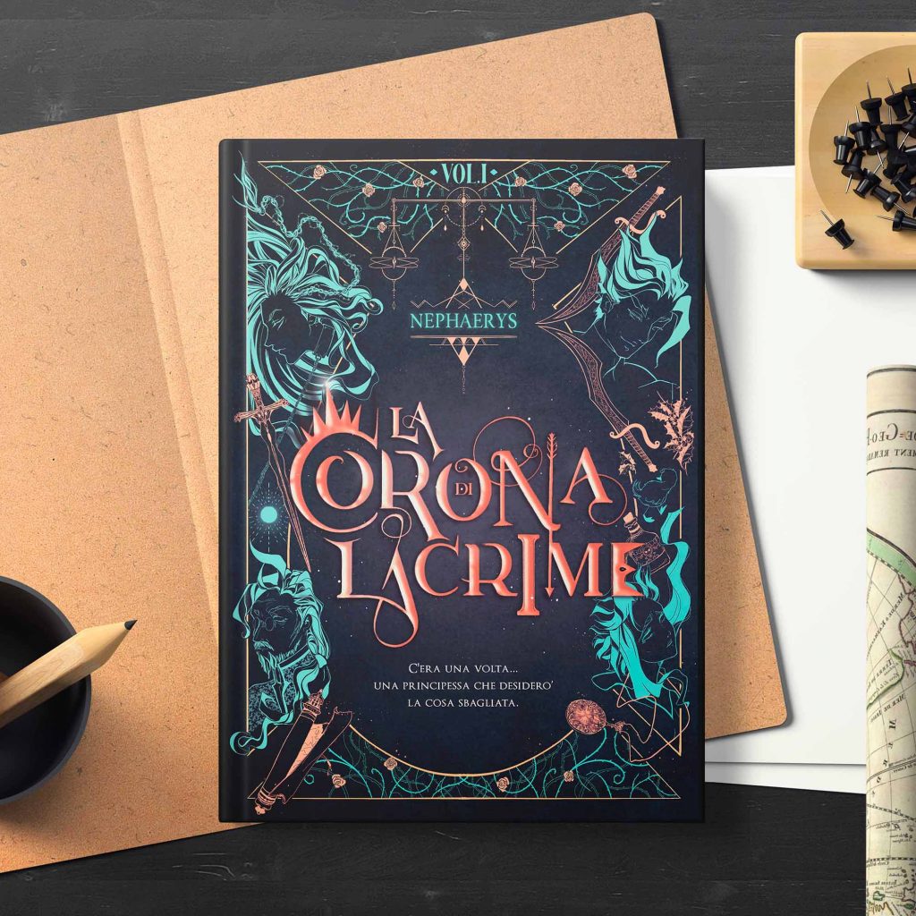
Project Summary La Corona di Lacrime (“The Crown of Tears”) marks the beginning of an epic journey within a captivating quadrilogy of high fantasy, new adult and romance by the young Nephaerys. In crafting this project, I’ve constructed an illustrated cover, drawing from the intricate and dark hues of the narrative, paying particular attention to capturing the essence of its young target. On the following slide, you’ll also find the sellsheet I’ve developed to promote book and its author at publishing events, along with the character designs for the story’s protagonists. Project Details USED SKILLS Editorial DesignLayout BuildingIllustrationGraphic DesignCopy WrithingCreative WritingTraditional DesignDigital Art TOOLS AND MATERIALS Adobe IndesignAdobe PhotoshopProcreatePages DATE 2022 RELATED PROJECTS Your eyes’ voice | Book Cover Cruel Fables | Illustrated Book Project Details USED SKILLS Editorial DesignLayout BuildingIllustrationGraphic DesignCopy WrithingCreative WritingTraditional DesignDigital Art TOOLS AND MATERIALS Adobe IndesignAdobe PhotoshopProcreatePages DATE 2022 RELATED PROJECTS Your eyes’ voice | Book Cover Cruel Fables | Illustrated Book SIMILAR PROJECTS Previous ProjectNext Project
Beka Fight Team
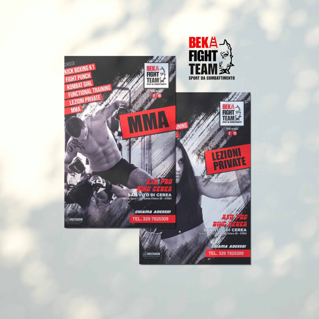
Project Summary Beka Fight Team is a gym located in Cerea, northern Italy, promoting courses in various disciplines including kickboxing, fight punch, MMA, Kettle, and functional training. Through collaboration with Instagrow, I designed 6 flyers to promote their courses, each dedicated to a specific activity. The focus is on the featured course in the image, with additional courses highlighted to enrich the gym’s offerings. The flyers’ style reflects the colors of their logo and the dynamic communication style of the clients, ensuring impactful and engaging promotions. Project Details USED SKILLS Graphic DesignEditorial DesignProto Editing TOOLS AND MATERIALS Adobe IllustratorAdobe Photoshop DATE 2019 CLIENT Beka Fight Team is a gym located in Cerea, northern Italy, promoting courses in various disciplines including kickboxing, fight punch, MMA, Kettle, and functional training. Facebook RELATED PROJECTS Instagrow Project Details USED SKILLS Graphic DesignEditorial DesignProto Editing TOOLS AND MATERIALS Adobe IllustratorAdobe Photoshop DATE 2019 CLIENT Beka Fight Team is a gym located in Cerea, northern Italy, promoting courses in various disciplines including kickboxing, fight punch, MMA, Kettle, and functional training. Facebook RELATED PROJECTS Instagrow SIMILAR PROJECT Previous ProjectNext Project
Red Blood | Book Cover
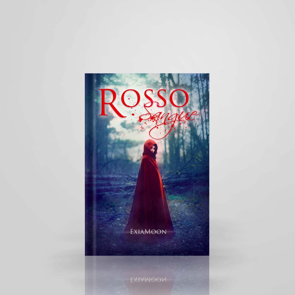
Project Summary Rosso sangue (Blood Red) is a dark fantasy novel written by a young author known by the pseudonym ExiaMoon. The author personally commissioned me to create the cover with the aim of captivating the target audience and portraying the story’s protagonist. Project Details USED SKILLS Editorial DesignPhotomanipulation TOOLS AND MATERIALS Adobe Photoshop DATE 2017 Project Details USED SKILLS Editorial DesignPhotomanipulation TOOLS AND MATERIALS Adobe Photoshop DATE 2017 SIMILAR PROJECTS Previous ProjectNext Project